


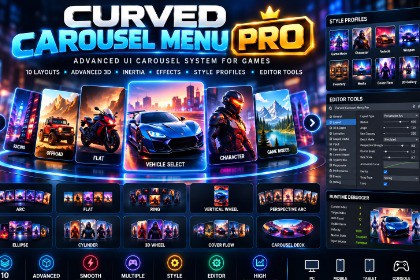
A professional Unity UI carousel framework with 10 layouts, advanced 3D depth, inertia, spring snapping, item states, effects, style presets, responsive fitting, editor tools, and a built-in debugger.Curved Carousel Menu Pro is built using Unity uGUI and standard Unity UI components. It does not use SRP-specific shaders, materials, or rendering features. The UI system is designed to work with Built-in, URP, and HDRP render pipelines. No custom render pipeline configuration is required.Curved Carousel Menu Pro is a professional Unity UI carousel framework for creating advanced game menus, character selection screens, vehicle selection screens, game-mode selectors, weapon selection interfaces, inventories, media browsers, galleries, and other interactive UI experiences.The package provides 10 carousel layouts, advanced 3D depth and perspective controls, smooth snapping, inertia and momentum, item states, center and hover effects, customizable style profiles, responsive UI options, layout morphing, editor tools, and a runtime debugger.LAYOUTSClassic layouts:• Arc• Flat• Ring• Vertical WheelAdvanced Pro layouts:• Perspective Arc• Ellipse• Cylinder• 3D Wheel• Cover Flow• Carousel DeckADVANCED 3D AND DEPTH• Z-depth positioning• Simulated perspective• Native camera perspective• Depth-based scale• Depth-based opacity• Depth-based rotation• Configurable depth curves• Depth sorting• Center item priorityANIMATION AND MOTION• Smooth snapping• Instant snapping• Spring snapping• Elastic snapping• Bounce snapping• Custom AnimationCurve support• Inertia and momentum• Velocity and deceleration controls• Friction• Drag resistance• Edge resistance• Rubber-band overscroll• Layout morphing• Selection effects• Arrival effects• Optional animation while the game is pausedINPUT• Mouse drag• Touch• Swipe• Mouse wheel• Keyboard• Gamepad• Previous and Next buttons• Click and tap selection• Configurable input sensitivity• Swipe and drag thresholds• Wheel sensitivity• Gamepad dead zone• Navigation repeat controlsITEM STATESThe Pro system supports configurable item states including:• Normal• Hovered• Focused• Selected• Locked• Disabled• Hidden• TransitioningState properties can include scale, opacity, rotation, color, position offset, depth, interaction, and animated transitions.CENTER AND HOVER EFFECTSOptional center-item effects include:• Scale• Color• Glow• Outline• Shadow• Brightness• Saturation• Position• Rotation• DepthHover effects can include scale, brightness, opacity, rotation, offset, transition duration, and animation curves.CUSTOMIZATIONCarousel items can contain:• Background images• Main images• Icons• Titles• Subtitles• Badges• Lock indicators• Custom content• Completely custom item prefabsDevelopers are not restricted to a specific card visual design.STYLE PROFILESCarousel Style Profiles use ScriptableObjects to store reusable carousel configurations including layout, colors, scale, opacity, rotation, animation, snapping, depth, center effects, and input settings.The package includes ready-to-use style presets and allows developers to create and edit their own profiles.RESPONSIVE UIThe carousel supports responsive configurations for:• 16:9• 16:10• 4:3• 9:16• Portrait• Landscape• Mobile• Tablet• DesktopDevelopers can configure settings based on screen orientation, aspect ratio, and resolution class.EDITOR TOOLSThe Pro package includes a professional custom Inspector with organized controls for:• General• Layout• 3D• Depth• Animation• Snap• Input• Item States• Center Effects• Style• Performance• Events• DebugScene View preview and gizmos can display curves, radii, centers, item positions, depth, direction, active items, and visible slots.DEBUGGERThe built-in debugger provides information such as:• Current index• Item count• Visible item count• Velocity• Snap state• Input state• Layout mode• Pooled objects• Selected item• Hovered item• Loop stateDEVELOPER APIThe package provides a public API for navigation, selection, item management, layouts, style profiles, input, looping, visible slots, and item access.It also supports UnityEvents and C# events for center changes, selection, clicks, scrolling, item creation/removal, layout changes, and snap transitions.PERFORMANCEThe carousel uses pooling and item reuse where appropriate to avoid unnecessarily creating large numbers of UI objects.It is designed to support larger item collections while keeping the number of active visible objects close to the required visible slots where the architecture permits.MULTIPLE CAROUSELSMultiple carousels can be used on the same screen, with navigation input controls to prevent keyboard or gamepad input from unintentionally controlling every carousel.DEMO CONTENTThe package includes a professional demonstration scene showcasing all 10 layouts.Additional examples demonstrate real-world uses such as:• Racing Game Mode Selection• Character Selection• Custom Cards• Locked Items• Selected Items• Center Effects• Cover Flow• Perspective ArcREQUIREMENTS• Unity 6000.3.16f1• Unity UI / uGUI• TextMeshPro• Unity Input System for keyboard and gamepad functionalityThe package does not require DOTween, LeanTween, paid plugins, or external UI frameworks.Curved Carousel Menu Pro is designed to be customizable and can be adapted to different game genres and UI styles, including racing, RPG, arcade, sci-fi, fantasy, mobile games, inventory systems, character selection, vehicle selection, and media/gallery interfaces.• 10 carousel layouts• Arc layout• Flat layout• Ring layout• Vertical Wheel layout• Perspective Arc layout• Ellipse layout• Cylinder layout• 3D Wheel layout• Cover Flow layout• Carousel Deck layout• Advanced 3D depth system• Simulated and native perspective• Depth-based scale, opacity, and rotation• Configurable depth sorting• Smooth and instant snapping• Spring snapping• Elastic and bounce snapping• Custom AnimationCurve support• Inertia and momentum• Friction and deceleration• Drag resistance• Edge resistance• Rubber-band overscroll• Configurable swipe and drag thresholds• Mouse, touch, swipe, keyboard, gamepad, and mouse-wheel input• Previous and Next button support• Configurable input sensitivity• Multiple carousel input focus support• Normal, Hovered, Focused, Selected, Locked, Disabled, Hidden, and Transitioning item states• Configurable state scale, opacity, rotation, color, offset, depth, and interaction• Center-item effects• Hover effects• Selection and arrival effects• Custom item prefab support• Custom images, icons, titles, subtitles, badges, and content• ScriptableObject Style Profiles• Reusable style configurations• Responsive UI profiles• Portrait and landscape support• Mobile, tablet, and desktop configurations• Animated layout morphing• Multiple carousel support• Pause/time-scale support• Item pooling and reuse• Dynamic item management• C# API• UnityEvents• C# events• Custom Inspector• Scene View preview• Scene View gizmos• Runtime Debugger• Demo generator• Professional demo scenes• Code samples• Documentation• Unity Input System support• No DOTween dependency• No third-party runtime UI frameworkThis package was created with the aid of AI. Its contents were generated, completely or in part, with Claude (an AI assistant by Anthropic).AI-generated content:- All C# code: runtime scripts, Editor tools (Inspector, debugger window, menus, demo generator), the demo controller and the sample scripts, plus the assembly definitions.- The default card prefab, the demo scene and the 8 style-profile presets, produced by build scripts written with AI.- The demo images and card sprites (Demo/Art, Prefabs/Sprites), generated procedurally by code written with AI. No image-generation model was used and no third-party images are included.- The documentation (Markdown guides, PDF manual and changelog).Work by the publisher (CodeStart-AI): defined the product scope and features, imported and tested the package in Unity 6000.3.16f1, reported the problems found during testing and had them fixed, and reviewed the package before submission.