


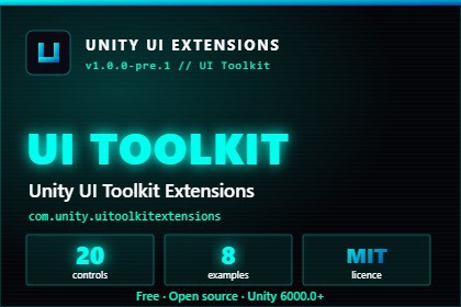
25 free, USS-themable UI Toolkit controls for Unity 6. Pills, toggles, steppers, scroll snap, toasts and more. Open source, MIT, production-ready.Updated all review comments as requestedSupercharge your Unity UI Toolkit. Stop rebuilding the same buttons, inputs and navigation widgets from scratch. Unity UI Toolkit Extensions gives you 25 polished, data-driven controls built natively for the modern UI Toolkit runtime — fully USS-themable, edge-case handled, and ready to drop into your project today.This is the UI Toolkit half of the Unity UI Extensions ecosystem: two packages, one ecosystem. The long-running uGUI package (Unity UI Extensions, 101 controls) covers classic Canvas UI; this package brings that same community-driven polish to UI Toolkit and USS.Two packages. One ecosystem. 100% free.Why developers use it- Ship weeks faster. These are the controls you would build anyway — pills, steppers, toggles, scroll snap, toasts — already polished and documented.- Native UI Toolkit & USS. Built data-driven on the modern runtime. Style everything with USS, no bespoke render hacks.- Production-tested community work. Part of a UI control collection the Unity community has relied on since 2015.- UPM-first distribution. Clean dependency management via git URL.- Fully customisable. Every control is USS-themable — recolour, restyle and reskin to match your game.- Examples included. 12 playable example scenes show every control in context.- Open contribution. MIT licensed. PRs welcome. Every contributor credited.The 25 controlsButtons- PillButton — rounded pill-style button.- ToggleButton — stateful on/off button.- ColorToggleButton — toggle button with colour-state feedback.- ColorToggleGroup — mutually exclusive group of colour toggles.- CircularImageButton — circular image-backed button.- IconLabelButton — icon + label button combo.Input**- PillInputField — pill-shaped text input.- PillSelector — segmented pill selector.- RoundedInputField — rounded text input field.- QuadrantStepper — four-directional step selector / overlay compass.- DropDownControl — drop-down selection input control.- SocialLinkContainer — editable list of platform-labelled social link fields.Navigation & Progress- ScrollSnap — snapping horizontal/vertical scroller.- PageDotIndicator — paged dot indicator for carousels.- StepProgressBar — multi-step progress indicator.- CollapsibleSection — expand/collapse content section.- ScreenHeader — configurable top app-bar with title and up to four edge action buttons.- DropDownMenuControl — anchored overlay action menu with large tappable rows.- ElasticListView — vertical list with elastic overscroll and swipe-up load-more.Feedback & Display- LoadingIcon — animated loading indicator.- GrayscaleImage — image rendered in greyscale.- ImageCropOverlayControl — image crop overlay control for cropping/masking images.- ToastSwipeDismiss — swipe-to-dismiss toast notification.- ComingSoonMessage — placeholder / coming-soon message panel.- NotificationBadge — unread-count badge that auto-hides at zero and clamps to "99+".> 6 buttons + 6 input controls + 7 navigation & progress controls + 6 feedback & display controls = 25 controls.---Key Features- 25 native UI Toolkit controls, ready to use.- Data-driven, built with USS — fully themable and reskinnable.- 12 example scenes demonstrating every control.- ~26 C# runtime scripts; lightweight footprint.- MIT licence — free for commercial and personal projects, no lock-in.- Installs via UPM git URL; clean dependency management.- Community-driven and open source; contributions welcome.- Companion to the uGUI "Unity UI Extensions" package (101 controls) — together, 126 controls across both Unity UI systems.All the controls in this package were created and are managed by human hands.The examples were crafted with some limited AI support