




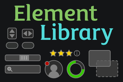
35+ production-ready UI Toolkit controls for Unity 6+: steppers, dropdowns, cards, tabs, accordions, mobile sheets, and more. All UXML-authorable, keyboard-accessible, full C# source.UI Toolkit gives you Button, Toggle, Slider, and a handful of primitives. Everything past that — a star rating, a tag input, a color picker, a swipeable bottom sheet, a reorderable list, a context menu with submenus — you build yourself, control by control, and then maintain. Element Library is the missing standard library for Unity 6+: more than thirty-five finished VisualElement controls that drop into UI Builder, respond to keyboard and gamepad, fire clean change events, and run with zero steady-state allocations.These are not skinned demos. Each control has a tested logic core (gesture thresholds, hit-tests, masking math) separated from its view, BEM-named USS hooks for restyling, [UxmlElement] attributes so it shows up in UI Builder with an inspector, and graceful disabled-state handling. Open a component, drop it in a UXML file or new it up in C#, wire one event, and ship.More than thirty-five controls, one import.Inputs and forms: NumberStepper, QuantityStepper, RangeSlider (dual-handle), Rating (half-steps), PinInput / OTP, MaskedInput (phone, date, SSN), SearchBar (debounced), TagInput, Autocomplete, MultiSelectDropdown, and ColorPicker (HSV/RGB/hex, standalone; sharper gradients with Visual Styling). Data display: Avatar (initials fallback + status), Badge, NotificationBadge, ProgressRing, StatusIndicator, Card, SkeletonLoader, StatCard, EmptyState, Tooltip. Layout and navigation: Accordion, Pagination, BreadcrumbNav, WizardStepper, TabBar (closeable, reorderable), ResizableSplitter, ScrollSnap, SegmentedControl, Popover, ContextMenu. Mobile and gesture: BottomSheet, SideDrawer, PullToRefresh, SwipeActions, FloatingActionButton, MobileScrollView. Plus utilities: drag-and-drop hooks, ReorderableList, FilePicker, and an iOS-style Switch.Authorable in UI Builder.Every control is a [UxmlElement] with kebab-case attributes, so it appears in UI Builder's library, drops onto the canvas, and exposes its properties in the inspector — allow-half, low-value, max-tags, and the rest. Author your screen visually, or build it entirely in C# with the same public API. No code-gen step, no custom importer.Built for keyboard and gamepad.Roving Tab / Shift+Tab focus, arrow-key navigation, Enter/Space activation, and Escape-to-dismiss on every overlay — not bolted on, but designed in. Controls blur focus and short-circuit input when disabled in the hierarchy, so a greyed-out field never eats a keypress. The focus model is ready for the KrookedLilly Focus & Navigation asset to add full D-pad and stick navigation on top.Mobile patterns UI Toolkit doesn't ship.BottomSheet with drag, snap points, scrim tap-to-close, and elastic overscroll. SideDrawer with edge-swipe reveal and drag-to-close. PullToRefresh that fires an async callback. SwipeActions that reveal leading and trailing buttons. A FloatingActionButton with speed-dial and auto-hide-on-scroll. These are the interactions players expect from a modern app, implemented as real gesture handlers — not CSS approximations.Clean events, no polling.Interactive controls expose plain event Action members — ValueChanged, SelectionChanged, and friends — that fire only on a genuine change, never per frame. Debounce, shimmer, and animation all run on UI Toolkit's scheduler and pause when an element leaves the panel, so nothing ticks in the background.Effects when you want them, plain when you don't.Badge, RangeSlider, SkeletonLoader, and ColorPicker render gradients standalone (baked texture, Unity 6000.0+) and sharpen to Painter2D mesh quality when the KrookedLilly Visual Styling asset is installed. Card, Avatar, and StatusIndicator add soft drop shadows and glows with Visual Styling and fall back to flat rendering without it. ProgressRing renders gradient arcs natively via Unity 6.3's vector API; on 6.0–6.2 a gradient ring falls back to a solid stroke. No integration is required for any of these controls to be fully functional.A demo for every control.Every component ships a demo that instantiates it and exercises every interaction in Play mode — drag the splitter, swipe the row, open the context menu's submenus, snap the carousel. Every control has a ready-to-open Play-mode scene. Run one to see exactly how a control behaves before you wire it into your project.Part of the KrookedLilly UI Toolkit Components suite.Element Library works standalone, but it's also part of a suite of UI Toolkit assets that snap together. Cross-asset integrations ship disabled and are enabled from a single Tools, KrookedLilly, Setup window — no auto-magic and no hidden dependencies. Pair it with Visual Styling for shadows, gradients, and glows, Focus & Navigation for gamepad input, or the Tween Engine for animated transitions.Full C# source, no DLLs.XML documentation on every public API, and a tested logic layer you can read and extend. Components work against the stock UI Toolkit module — no forced package upgrades, no external dependencies, no popups or login on import.ControlsInputs: NumberStepper, QuantityStepper, RangeSlider, Rating, PinInput, MaskedInput, SearchBar, TagInput, Autocomplete, MultiSelectDropdown, ColorPickerData display: Avatar, Badge, NotificationBadge, ProgressRing, StatusIndicator, Card, SkeletonLoader, StatCard, EmptyState, TooltipLayout and navigation: Accordion, Pagination, BreadcrumbNav, WizardStepper, TabBar, ResizableSplitter, ScrollSnap, SegmentedControl, Popover, ContextMenuMobile and gesture: BottomSheet, SideDrawer, PullToRefresh, SwipeActions, FloatingActionButton, MobileScrollViewUtilities: drag-and-drop hooks (MakeDraggable / MakeDropTarget), ReorderableList, FilePicker, SwitchAuthoringEvery control is a [UxmlElement] with kebab-case UXML attributes and full UI Builder inspector supportIdentical C# API for code-first constructionPublic …UssClassName constants and BEM-named hooks for restylingAccessibility and inputRoving Tab / Shift+Tab focus, arrow-key navigation, Enter/Space activation, Escape-to-dismiss overlaysDisabled-state handling blurs focus and ignores input when not enabled in the hierarchyFocus model ready for Focus & Navigation gamepad integrationArchitectureTested logic cores separated from views (gesture thresholds, hit-tests, masking math)Plain event Action change events, fired only on real changeScheduler-driven animation/debounce that pauses on detach; zero steady-state allocationsVisual Styling integrationOptional, gated by KROOKEDLILLY_ELEMENT_LIBRARY_VISUAL_STYLING_INTEGRATION (Setup-window toggle)Badge, RangeSlider, SkeletonLoader, and ColorPicker render gradients standalone (baked, 6000.0+); the integration upgrades them to mesh-quality Painter2D gradientsCard, Avatar, and StatusIndicator add soft drop shadows and glows via the integration; they degrade to clean flat rendering without itNo API changes, no breakage — all controls work correctly in both modesIncluded demosA demo for every control, fully interactive in Play mode — a ready-to-open scene for every controlShared demo theme; no external art dependenciesCompatibilityUnity 6+ (6000.0 and newer)UI Toolkit (com.unity.modules.uielements)New Input SystemFull C# source, no DLLsXML documentation on all public APIsNo external dependencies; optional, gated cross-asset integrationsAI (Claude Code) was used as a development assistant throughout the package creation process. This includes code generation, architecture design, writing unit tests, documentation authoring, and debugging. All AI-generated code was reviewed, tested, and validated by the developer. The final package is 100% human-supervised C# source code with no AI runtime components.