

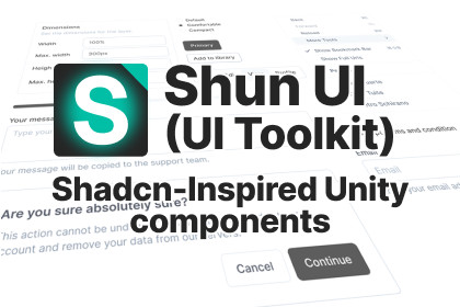
Shun UI (UI Toolkit version) - Shadcn-Inspired Components
Experir
$54.99
$76.99
29%OFF
Jump AssetStore
Modern UI component library for Unity UI Toolkit.
40+ customizable components with runtime theme switching.
Copy, modify, and own your UI - no rigid templates!Projects using Unity 6.2 or earlier supports only PNG icons.On Unity 6.3 and newer, the package support both PNG and SVG icons.⚠️ Note: This asset represents the UI Toolkit version. If you’re interested in the Unity UI (uGUI) version, check out this asset: Shun UI (uGUI version)✨ What is Shun UI?Shun UI isn't just another Unity UI asset. It's a revolutionary approach to building game interfaces, inspired by shadcn/ui from web development. Instead of rigid templates, you get the building blocks to create YOUR own component library.🔗 Resources:📖 Full Documentation: https://www.experir.com/products/shunui-ui-toolkit/docs🎮 Interactive Demo: https://www.experir.com/products/shunui-ui-toolkit/demo🔥 Key Features:• 40+ Modern Components - Buttons, Inputs, Dialogs, Carousels, and more• Complete Ownership - Every UXML and USS file is editable and extendable• Beautiful Defaults - Professional designs that work out-of-the-box• Composable Architecture - Consistent naming and structure across all components• UI Toolkit Native - 100% built with UI Toolkit for modern workflows and performance• Vector-Ready Assets — Supports both .png and .svg icon formats, including full compatibility with Unity 6.3’s new VectorImage system• Runtime Theme Switching — Dynamically change styles with UI Toolkit themes. Customize your app’s look by editing a few global CSS variables in the USS file🎨 Available Components:Layout & Navigation: Accordion, Breadcrumb, Card, Tabs, MenuBar, NavigationMenuInput Components: Button, Input, Textarea, Checkbox, RadioGroup, Select, SliderFeedback & Display: Alert, Badge, Avatar, Progress, TooltipOverlay Components: Dialog, AlertDialog, Drawer, Popover, ContextMenAdvanced Components: Carousel, Collapsible, ScrollArea, Resizable, Toast System, DataTable, Skeleton💡 The Shun UI Philosophy:Traditional Unity UI packages lock you into their design decisions. Shun UI gives you ownership. Import components via UI Builder or by code, unpack them, then customize everything to match YOUR vision.🎯 Perfect For:• Game developers seeking modern UI components• Teams wanting consistent design systems• Projects requiring runtime theme switching• Developers who value customization freedom• Anyone tired of rigid UI asset limitations📦 What You Get:• 40+ Component Templates• Complete Theming System with Runtime Switching• Pre-built UI Blocks (SimpleMainMenu)• Example Scenes and Documentation🚀 Getting Started:Create a new UI Document and open UI BuilderIn the Library, drag the component into the HierarchyUnpack it and modify its attributes, structure, and USS propertiesBuild your unique component library!-OR-Create an instance of the component through C# codeModify its attributes, structure, and USS properties directly in C#Build your unique component library!Unity 6000.0 or Later: Full compatibility with latest Unity featuresLong Term Support (LTS): Recommended for production projectsRender Pipeline SupportBuilt-in Render Pipeline: ✅ Fully supportedUniversal Render Pipeline (URP): ✅ Complete compatibilityHigh Definition Render Pipeline (HDRP): ✅ Full supportCustom Render Pipelines: ✅ Works with any pipelineCore DependenciesUnity UI Toolkit: new Unity's UI SystemAI was instrumental in accelerating Shun UI's development through automated code generation, component architecture design, documentation creation, and quality assurance.