

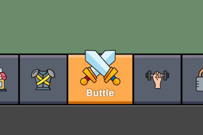
Animated bottom navigation panel for UGUI. Dead-simple setup: define tabs and target canvases in the Inspector - done. Use your own icons and text prefab. Mobile-ready.What it isHungrycraft Game Navigation Bar (UGUI) is an animated bottom tab bar for Unity UI. It instantiates buttons from a list, evenly distributes width, animates selection (width/height, icon scale/offset, text reveal), and activates the target Canvas per tab. Locked tabs (no Canvas) are non-interactable.Why it’s usefulDrop-in mobile navigation for menus/hubs. Clean API, inspector-driven. Works with your own Text or TMP text prefab—no forced styling.What’s includedPrefabs: Assets/GameNavigationBar/Prefabs/NavigationPanel.prefab (base), Assets/GameNavigationBar/Example/Prefabs/MainMenu.prefab (ready setup)Example scene (portrait 1080×2340)Scripts: NavigationPanel.cs (component), AudioManager.cs (example click sound)PDF guide: Assets/GameNavigationBar/Documentation/HungryUI_NavigationPanel_Guide.pdfKey featuresRuntime item list (name, icon, canvas, per-item active background, icon size/offset, text offset)Even width distribution with animated “active weight” vs “inactive weight”Height animation (or full-height stretch)Icon upscale + vertical offset on selectGlobal inactive background + optional separators (fixed width, non-animated)Text via your prefab (UGUI Text or TMP_Text). We only set the string; you keep fonts/colors/sizesEvent: OnButtonPressed(int index) (unlocked tabs only)Works without any TMP dependencyQuick setupEnsure the scene has Canvas + EventSystem.Drop NavigationPanel.prefab into the Canvas (or start from MainMenu.prefab).Add Items in the Inspector (name, icon, optional Canvas/background).Assign a Text Prefab if you want custom label styling.Tune Animation + Icon Animation, pick DefaultActiveIndex, done.Targets & compatibilityUnity: tested on LTS 2021.3+ and 2022.3+ (UGUI)Platforms: mobile/desktop; example authored for 1080×2340 portraitNo extra packages required (TMP optional)License© 2025 Hungrycraft — Licensed for use within your projects. Redistribution/repackaging/resale as a competing asset is not permitted. Compiled builds may include this asset.RequirementsBuilt-in UGUI. Place the prefab under a Canvas as usual.Only scene requirement: an EventSystem (Create → UI → Event System).No extra packages (TMP optional if you use a TMP text prefab).Inspector parametersItems (Tabs) — list of NavigationItem:ButtonName — label text shown when the tab is active (string).Icon — tab icon (Sprite).TargetCanvas — Canvas activated on select; null = locked (non-interactable, event not fired).ActiveBackground — per-item background when active (Sprite, optional).IconSize — icon size (Vector2, px). If ≤0 in any axis → defaults to 100×100.IconOffset — local (x,y) offset of the icon inside the button (Vector2).TextOffset — vertical distance below the icon bottom (float; can be negative to overlap).Layout & Stretch:StretchBackgroundToWidth — use sliced/simple fill to cover the button rect; width is always weight-based.StretchBackgroundToHeight — fill panel height (disables height animation). Off → height animates.Common Visuals:GlobalInactiveBackground — default background for inactive tabs (Sprite, optional).GlobalSeparatorSprite — optional separator between buttons (fixed width; non-animated).SeparatorWidth — separator width in px (float).Text Prefab:Prefab with Text or TMP_Text. The component sets only the string; styling (font/size/color/auto-size) is your prefab.Animation (width/height):activeWidth / inactiveWidth — width weights (drive LayoutElement.flexibleWidth).activeHeight / inactiveHeight — heights when height is not stretched.animationTime — tween duration for width/height/icon/text.Icon Animation:iconScaleMultiplier — icon upscale on select (e.g., 1.2).iconOffsetY — extra vertical offset on select (can slide above panel edge a bit).Selection & Events:DefaultActiveIndex — initial tab; out-of-range → logs and falls back to 0.OnButtonPressed(int index) — fired on click for unlocked tabs only.Behavior / Implementation notesWidth is distributed by weights across buttons; separators are layout siblings with fixed width and never tween.If a button has no background sprite, its root Image remains enabled with alpha=0 so the whole button stays clickable.Button transition = None — visuals are handled by the component (no tinting).Text is top-center anchored and positioned under the icon (uses TextOffset).Used source file(s) sizesSample sprites: PNG, typically 256–1024 px; separators are thin PNGs. All visuals are optional.File count (approx.)~2 scripts, 2 prefabs, 1 example scene, 1 PDF guide (+ sprites if included).AnimatedYes — width weight tween, height tween (if not stretched), icon scale + Y offset, delayed text reveal.Animation type listLayoutElement.flexibleWidth tween (active vs inactive weights)LayoutElement.preferredHeight tween (if height animation enabled)Icon scale/position tweenText show with position update under iconAdditional: Vector or pixel based?Pixel-based by default; works fine with vector/TMP content if you supply it via your prefab.