


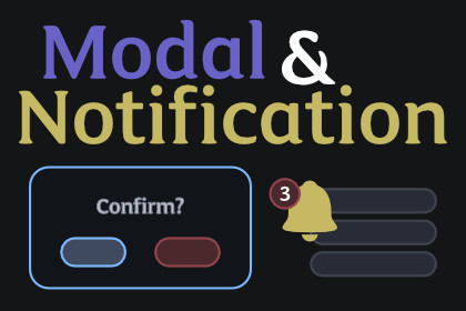
Async modal dialogs, toasts, loading overlays, and popup menus for Unity UI Toolkit. One drop-in component, five demo scenes, zero hard dependencies.Unity's UI Toolkit ships with VisualElements and USS but no modal API, no toast system, no popup menu primitive, and no loading overlay. Every game ends up rebuilding the same scaffolding — input blocking, z-order stacking, backdrop dimming, queue management, and enter/exit animations — from scratch.This asset is the missing layer. Drop a single OverlayManager component on your UIDocument and your panel gains async/await modal dialogs, a full toast notification system, region-scoped loading overlays, popup menus with anchor-flip positioning, and a built-in keyboard focus trap.Modals that feel native.Five dialog types out of the box: ModalDialog.AlertAsync, ConfirmAsync, PromptAsync, ChoiceAsync, and ShowCustomAsync. Every dialog is awaitable so your code reads top-to-bottom — bool ok = await ModalDialog.ConfirmAsync("Delete?", "This cannot be undone."). Cancellation tokens, Escape-to-dismiss, default-button Enter handling, and a destructive-action preset all ship configured. The built-in keyboard focus trap keeps Tab and arrow navigation inside the topmost modal.Toasts with real ergonomics.Four toast types (Info / Success / Warning / Error), seven positions covering every UI corner, per-position lane stacking, queue management with three overflow strategies (Queue / ReplaceOldest / Drop), and a ToastHandle for live updates and dismissal. Toasts support icons, action buttons, progress bars, persistent variants, swipe-to-dismiss, and tap-to-dismiss. The static Toast.Show* API handles the simple case; ToastOptions exposes the full configuration surface when you need it.Loading overlays that just work.LoadingOverlay.ShowAsync blocks input on the entire panel; ShowInRegionAsync(region, ...) blocks input only inside a supplied VisualElement so the rest of your UI stays interactive. Four indicator styles ship animated from C# so they work without any USS theme: Spinner (rotating ring), HorizontalBar (determinate fill), CircularRing (true radial arc drawn via Painter2D), and Shimmer (sweeping highlight). A LoadingHandle updates message and progress on the fly. A minimum-display-time guard prevents the flash you get when a load operation completes faster than the user can see it.Popups, dropdowns, and tooltips included.PopupMenu.ShowAtAsync with enabled/disabled rows, separators, icon text, and shortcut hints. Dropdown is searchable, single or multi-select, and virtualized via ListView so 100+ options stay responsive. Tooltip.Attach wires hover/focus tooltips with configurable delay. Every popup automatically dismisses on outside click, Escape, or a second click on the trigger element (toggle-to-close). A pure-function PopupAnchorResolver flips popups to the opposite edge when the preferred side would overflow the viewport.Theming via CSS custom properties.Override the bundled ModalNotificationsDefaultTheme.uss by setting 35+ CSS custom properties in your own USS — modal background, toast colors, loading indicator color, popup background, tooltip background, and more. A dark theme variant ships as a .theme-dark override class. The default theme auto-loads at runtime so overlays look correct the moment you press Play.Five demo scenes included.Modal Showcase (Alert / Confirm / Prompt / Choice / Destructive), Modal Stacking (three layered modals with compounding backdrops and LIFO dismissal), Toast Gallery (every type and position), Loading Overlay (all four indicator styles plus the region variant), and Popup Menu (context menu, dropdown, tooltip). Each demo ships with UXML, USS, controller script, and a README explaining what it shows.Works with UI Toolkit: Screen Manager.Opt into automatic overlay dismissal when a screen exits — useful when navigating away from a level / settings panel should also close any open modal or notification. Install UI Toolkit: Screen Manager, then open Tools > KrookedLilly > Setup and enable the Screen Manager → Modal & Notifications integration, then:ScreenManagerIntegration.DismissOverlaysOnScreenExit = true;Animated transitions via UI Toolkit: Tween Engine.For smooth modal, toast, and dropdown enter/exit transitions, install UI Toolkit: Tween Engine, then open Tools > KrookedLilly > Setup and enable the Tween Engine → Modal & Notifications integration. The integration registers an OverlayAnimationProvider that interpolates opacity and scale with configurable easing. Without Tween Engine, overlays appear and disappear instantly.Works with UI Toolkit: Focus & Navigation.Install UI Toolkit: Focus & Navigation, then open Tools > KrookedLilly > Setup and enable the Focus & Navigation → Modal & Notifications integration. The element that triggered an overlay is automatically refocused when the overlay dismisses, so keyboard and gamepad navigation pick up where the user left off. Works with any focusable element — no per-overlay wiring needed.Works with UI Toolkit: Responsive Layout.Install UI Toolkit: Responsive Layout, then open Tools > KrookedLilly > Setup and enable the Responsive Layout → Modal & Notifications integration. Overlays then automatically respect the device safe area — toasts stay clear of notches and home indicators, modals are padded inside the visible region. A .overlay-breakpoint-{name} USS class is applied to the overlay container per active breakpoint so you can resize toasts and modals per device class from your stylesheet.Every integration ships disabled by default; enable each one from the unified Tools > KrookedLilly > Setup window.Full C# source, no DLLs.XML documentation on every public API. Works with both Unity's Legacy Input Manager and the new Input System package. Zero hard dependencies on other assets.CoreOverlayManager component with z-order stack, configurable max depth, lazy-instantiated toast manager, async lifecycle timeout guard, and BlockTransitions signalOverlayBase state machine (Created → Entering → Visible → Exiting → Hidden) with CancellationToken plumbing, USS class toggling, and a pluggable animation-provider hookBackdrop element with dismiss-on-click and custom colorOverlayInputBlocker primitive — consumes pointer and navigation events via StopImmediatePropagation, IDisposableBuilt-in panel-root focus trap keeps Tab and arrow navigation inside the topmost overlay; supports NavigationCancelEvent so gamepad B button dismisses modalsModal DialogsModalDialog static API: AlertAsync, ConfirmAsync, PromptAsync, ChoiceAsync, ShowCustomAsyncModalOptions with DismissOnEscape, DismissOnBackdropClick, BackdropColor, custom button textAlertDefaults / ConfirmDefaults / DestructiveConfirmDefaults presetsModal enter/exit transitions supplied by the optional Tween Engine integration (scale + fade with configurable easing); without it, modals appear instantlyModalContainer with public USS class constants for restylingModalOverlay exposed publicly for advanced compositions (e.g., custom multi-modal flows)ToastsStatic Toast.Show* API plus full-power ToastManagerFour types (Info / Success / Warning / Error) and seven positionsToastHandle with Dismiss, UpdateMessage, SetProgress, IsActive, OnDismissed eventToastSwipeManipulator — horizontal/vertical swipe-to-dismiss with configurable thresholdToastOptions: icon, action button callback, progress bar, persistent, swipe/tap dismiss togglesLoadingLoadingOverlay.ShowAsync (full-screen) and ShowInRegionAsync (region-scoped via OverlayInputBlocker)Four indicator styles plus a Custom slot for caller-supplied visualsC#-driven animations: Spinner rotates via style.rotate; Shimmer sweeps an inner highlight bar; CircularRing strokes a true arc via Painter2DLoadingHandle with progress + message API and minimum-display-time guard (default 500 ms)PopupsPopupMenu.ShowAtAsync with PopupMenuItem (Label / IconText / ShortcutHint / IsEnabled / Callback) and separator supportDropdown.ShowBelowAsync — searchable, single or multi-select, ListView-virtualizedTooltip.Attach with above / below / left / right / auto positioningPopupAnchorResolver — pure static function that flips to the opposite side when the preferred edge overflowsPopupDismissHandler — scoped click-outside + Escape + toggle-on-trigger handler used by every popupThemingModalNotificationsDefaultTheme.uss with 35+ CSS custom properties auto-loaded at runtime via ResourcesModalNotificationsDarkTheme.uss — apply by adding .theme-dark to a parent elementPer-instance override via _customTheme serialized field on OverlayManagerOpt-out toggle (_applyDefaultTheme) for projects that ship their own complete themeEditorCustom OverlayManager inspector embeds the sibling UIDocument editor in a foldoutRuntime state panel shows active overlay count, BlockTransitions flag, and toast overflow behaviorHideFlags three-layer pattern (runtime guards + custom inspector + [InitializeOnLoad] enforcer) prevents Unity's known MissingReferenceException on play-mode exitWorks cleanly across domain reloads and play-mode transitionsIncluded demosModalShowcaseDemo — Alert, Confirm, Prompt, Choice, and Destructive variants with status loggingModalStackingDemo — three modals stack with compounding backdrops; focus trap retargets to the new topmost as each dismissesToastGalleryDemo — every toast type and position, plus action buttons and progress barsLoadingOverlayDemo — Spinner / HorizontalBar / CircularRing / Shimmer indicators plus a region-scoped variantPopupMenuDemo — context menu, dropdown, and hover-triggered tooltip with anchor-flipCompatibilityUnity 6+ (6000.0 and newer)UI Toolkit (com.unity.modules.uielements)Full C# source, no DLLsXML documentation on all public APIsZero external dependenciesAI (Claude Code) was used as a development assistant throughout the package creation process. This includes code generation, architecture design, writing unit tests, documentation authoring, and debugging. All AI-generated code was reviewed, tested, and validated by the developer. The final package is 100% human-supervised C# source code with no AI runtime components.